1 year after the rebrand – what have we learnt?

Companies sometimes change their names. We did just that a year ago, changing from TH-EY to THEY.dev. How did we navigate this rebrand and what lessons have we learnt? What are our key suggestions for everyone planning a rebrand?
Exactly one year ago, on 13 October 2025, we announced a major change. The name that had been with us from the very beginning made way for a new one, admittedly similar, but more accurately reflecting what we do. Simply swapping the logo on the homepage and calling it a day? Absolutely not. A rebrand like this is much more than just a change of signage.
The origins of the change
What prompted the company to change its name? This issue was well explained in an article by Filip Kubala exactly a year ago. The dash in the name caused complications: in spelling, in pronunciation, and, practically speaking, in communication. Having to spell out the company name almost every single time was frustrating, to say the least.
Another difficulty introduced by splitting the word THEY into two parts was the fact that we could be mistaken for a branch of the global consultancy giant, EY (formerly Ernst & Young).

This old logotype was with us for years. But it needed some change.
The name change was also an opportunity to refresh the graphic design associated with the brand. Before the rebrand, TH-EY’s characteristic black-and-white style was admittedly elegant and minimalist, but due to the lack of vivid colours, it was a bit less vibrant.

The new logotype was rather an evolutionary change than a revolution.
Preparing for the rebrand and associated concerns
Knowing that a change is necessary is not enough, though. A strategic decision regarding its direction is required. In this case, it was quite a broad one, as we were dealing with both the brand name and its visual identity. Such a decision naturally brings about certain concerns.
“There was some apprehension about the so-called transition period during the rebrand – a time when, for example, clients still have ‘old’ proposals sent under the old company name, while the new form is already functioning on the website, on social media, and in broader communication. I was somewhat worried about a situation where a client has a proposal and a link, clicks on it, but it doesn’t redirect to our domain, to the proposal they wanted to see. Was this a justified fear? It turned out it wasn’t,” said Filip Kubala, CEO of THEY.dev.
Potential disruptions to business processes were not the only concerns associated with the rebrand. Another was the design, or more precisely, the design creation process.
“In the context of working on the design, my biggest fear was the consequence of our decision-making process. Because we aspire to be a teal organisation, we ask the team for their opinions, and we genuinely take their feedback on board. This prolongs the process. Tastes, however, vary, especially when it comes to aesthetics,” admits Barbara Dobrucka, UI&UX Designer THEY.dev.
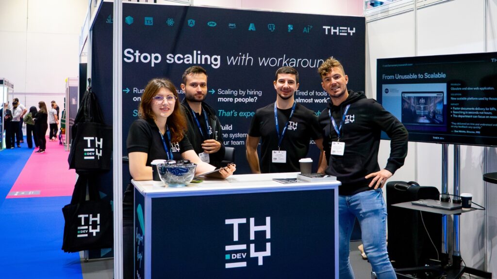
The conceptual work was stretched over time. And although in theory the company had not set a final deadline for the rebrand, a factor that was new to our business at the time proved crucial: participating in a trade exhibition, specifically The Business Show London. Ultimately, we managed to change not only the name but also the logo and visual identity in time to appear at the London event under our new banner.
Logo redesign as a complex process
“I really liked our old logo,” admits Barbara Dobrucka. “Even though it wasn’t perfect, it was pleasing, clear, and a bit technical. I think we all liked it. That’s why it was difficult to come up with something completely different.”
The company also benefited from the external perspective of a graphic designer who, together with the THEY.dev team, created subsequent versions of the new logo. Ultimately, the THEY.dev logo incorporates not only the general shape known from the previous logo. It also includes what became clear during the redesign stage: it is simultaneously a web address. Although the .dev domain category is not very well known, it perfectly reflects what we do, which has been incorporated into the logo. At the same time, it also features a new, teal element.
“I really like the change in terms of the colour scheme, our characteristic teal square. I also like the shift towards colourful gradients in our graphic materials. It makes our communication much more consistent and gives it its own character,” said Filip Kubala.
“Only after many iterations did we arrive at a great form. I am very happy with this change because we didn’t completely abandon our old logo. Just like the company name, it has changed, but remains similar, quite minimalist. And although black and white still dominate, the teal element is a symbol of our aspiration to be a teal organisation,” explains Barbara Dobrucka.
What have we learnt?
A change, though seemingly minor, requires time and proper planning. A company is inextricably linked to its name and visual identity. It is its visible reflection, an element that builds recognition. A bit like a national emblem or flag. There is a reason why major brands don’t change their names too often.
However, as Filip Kubala rightly points out, a major change in visual identity and logo may be significant primarily for companies with substantial brand recognition: “We haven’t lost anything in terms of visibility. This stems from the fact that our branding was never that well known. We are not a brand that sits literally in the minds of customers, like Nike or Coca-Cola. We appear at the exact moment a need arises.”
We have learnt, therefore, that the brand itself is not our strongest asset. It is the people, the team, alongside their skills and experience. At the same time, not everything went smoothly, and certain elements of the rebrand dragged on for several months. These were, admittedly, minor things, like login addresses for various services or our logo on those platforms, but they nonetheless took up valuable time and created the impression of an unfinished process.
“Among the more tedious aspects were the minor changes that still had to be implemented many weeks after the rebrand was announced,” admits Sara Grządkowska, Head of Operations THEY.dev. “If no one from the company had used a particular service for a while; the old login details, old logotypes, old company name often remained. Additionally, the proximity of the The Business Show London deadline made the preparation of physical branded materials, such as exhibition walls, business cards, etc., rather nerve-wracking.”
This is also a valuable lesson drawn from the rebrand. Preparing it properly should ideally take place with a larger time buffer before major events. It’s important to be sure that there is enough time for conceptual work, as well as for the preparation of physical materials already featuring the new visual identity.
“If I were to give one key piece of advice to anyone embarking on a rebranding and redesign process, it would be: prepare a detailed plan,” said Sara Grządkowska. “With all the activities, deadlines, and people responsible for specific tasks. This way, you will be able to manage the rebrand as an entire process.”